Cleveland Institute of Music

Helping a world-class conservatory show up online the way it performs on stage.

00

challenge

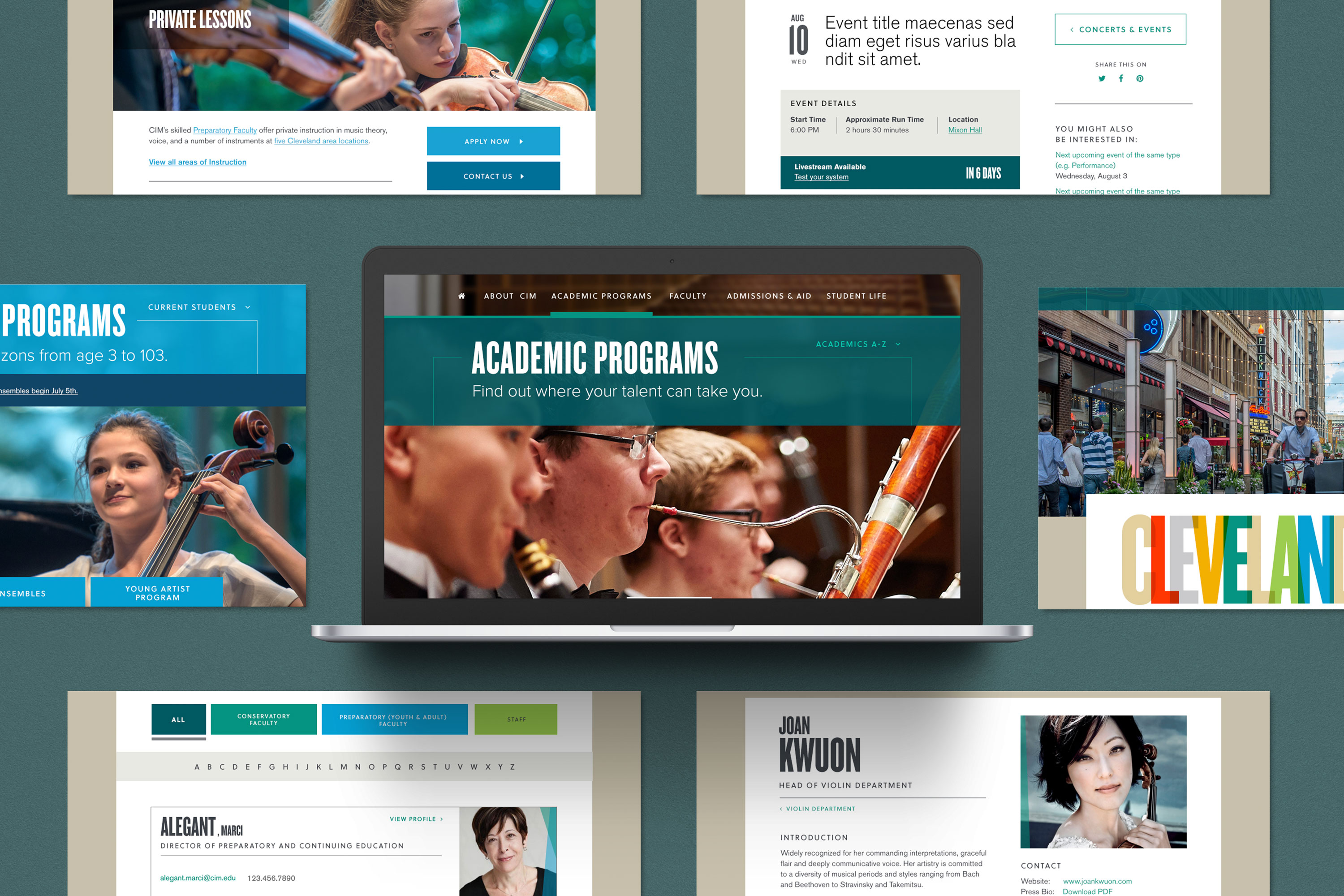
The Cleveland Institute of Music had a website that had grown disorganized over time, making it difficult for prospective students, faculty, and the broader arts community to find information or feel inspired by the institution. Navigation was complex, user pathways were unclear, and the visual presentation didn't reflect the prestige and creativity of a world-class conservatory.

solution

I led a complete redesign of CIM's primary website, starting with onsite workshops with leadership, students, and faculty, followed by user interviews and card-sorting sessions to reorganize the site architecture. From there I developed multiple visual directions and worked iteratively with leadership to refine content, navigation, and a design system that matched the caliber of the institution.

Nearly a decade later, the site is still standing — a testament to getting the architecture and visual foundation right the first time.

year

2016

timeframe

4 months

tools

Adobe Creative Suite, Lottie

category

Creative Direction, Design

01

The existing site had no clear pathways for its most important audiences: prospective students, current students, parents, and faculty all landed in the same undifferentiated experience. I ran card-sorting sessions and workshops onsite with CIM stakeholders to rebuild the architecture from the ground up, creating distinct, intuitive pathways for each audience without fragmenting the overall site.

02

CIM needed to feel both prestigious and welcoming, a balance that's easy to get wrong in either direction. Rather than designing full homepage concepts for leadership to judge from, I developed a design collage process — three distinct visual directions built from real UI components: buttons, icons, navigation, typography, and photography treatment. In hindsight, this was systems thinking before the industry had the language for it. Instead of selling a surface, I was showing how design decisions cascaded through the smallest elements of an interface. Reacting to granular decisions got us to alignment faster and with more confidence than a polished mockup ever would, and laid the groundwork for the visual system that followed.

03

The final site brought together everything learned through research and collaboration. Clean, confident navigation. A visual identity worthy of a world-class conservatory. A content structure that made it easy for every audience to find what they came for. Built to last — and it did.

207% increase in Request for Info submissions (YoY)
120%increase in campus tour signups (YoY)
40%increase in conservatory application starts (YoY)
32%increase in preparatory application submissions (YoY)

.let's connect

Always open to conversations where UI, brand, and systems leadership accelerate growth.

.let's connect

Always open to conversations where UI, brand, and systems leadership accelerate growth.