snapcare

Transforming a manual, internal operations tool into a scalable, public facing product with distinct, role based experiences across web and mobile.

00

challenge

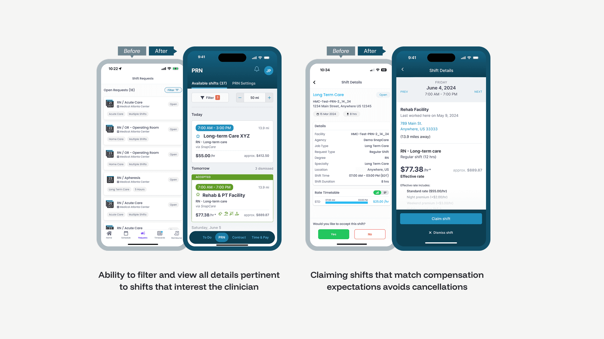
SnapCare built an internal staffing tool during COVID, but operated it entirely on behalf of clients. As they pivoted post-pandemic toward long-term care and a new managed services model, they needed a public-facing platform that could serve three very different users: healthcare facilities, staffing agencies, and clinicians, each with distinct needs and workflows.

solution

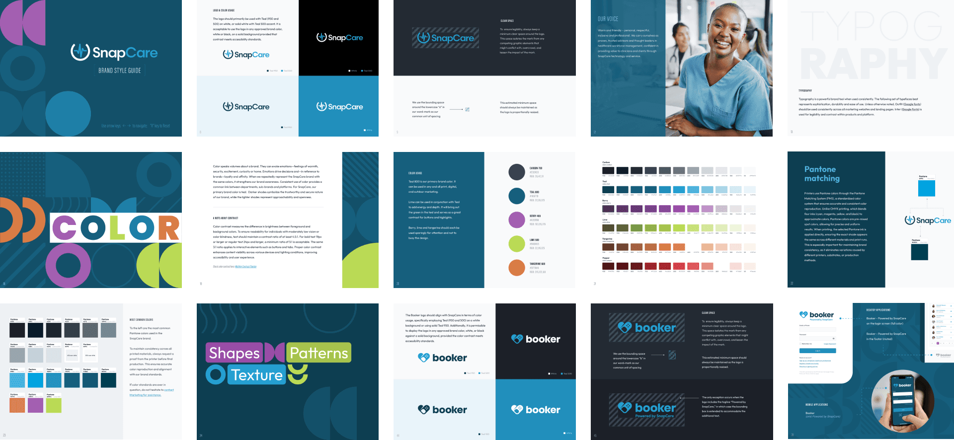
I led the design of a 0→1 platform that transformed their internal system into a multi-sided product. That meant designing three distinct experiences under one umbrella, establishing a shared component library to keep them cohesive, and working closely with the program and sales teams to make sure the product told a clear story, both to users and to prospective clients.

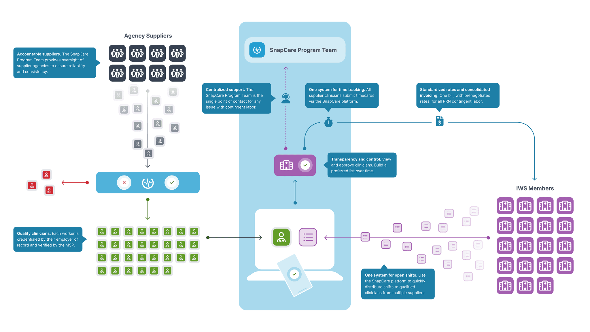
Before a single screen was designed, I worked with the program team to map out how the entire service model worked: who did what, when, and why. We distilled that complexity into a single diagram that became a sales tool. The fact that it ended up in pitch decks before the product shipped tells you something. Clarity at the system level makes everything downstream easier, from stakeholder alignment to individual screen decisions.


year

2025

timeframe

8 months

tools

Figma, Adobe Creative Suite, Miro, Jira, Procreate

category

Branding, Product Design, & Creative Direction

01

SnapCare was entering a new market and needed to show up with confidence. Before designing any product screens, I built a comprehensive brand standards guide covering logo usage, color palette, typography, shapes, texture, and a sub-brand identity for their clinician-facing app, Booker. Having this in place meant every touchpoint, from the product UI to pitch decks to marketing, pulled from the same system. It also gave the internal team the guardrails to stay consistent without needing a designer in the room for every decision.

02

With three distinct product experiences to build, a shared design system wasn't optional. I created a component library and documentation that spanned the facility portal, agency portal, and clinician app, all tied back to the brand standards. This kept the products visually cohesive, sped up the design and development handoff, and made iteration much faster as we incorporated user feedback. It was the kind of infrastructure investment that doesn't always get credited in a case study, but shapes the quality of everything that comes after it.

03

For healthcare facilities, the most critical task was creating and filling open shifts. Early on, that flow took over a minute to complete, which sounds minor until you realize this was something scheduling coordinators did dozens of times a week. After observing real usage and talking with the program team, I redesigned the flow to cut that time down to under 10 seconds. That's an 80%+ efficiency improvement on the task that mattered most to this user group.

04

Staffing agencies were a crucial but often-overlooked piece of the ecosystem. If they couldn't easily see which shifts their workers were eligible for, the whole marketplace fell flat. After an initial release and feedback round, I redesigned the agency experience to surface open shift opportunities much more prominently, directly improving their ability to place workers and generate revenue. Getting that loop right was essential to the program's success.

05

The clinician-facing mobile app required the biggest philosophical shift. The old model was passive: workers waited to be invited to shifts and said yes or no. My team and I redesigned the experience around the idea that clinicians should be able to find and claim their own work, more like a marketplace than a dispatch system.

06

07

08

That meant a cleaner dashboard for new users, a better shift browsing and comparison view, clearer pay information upfront, and a streamlined clock-in experience. Small changes in framing, big changes in how empowered users felt.

.let's connect

Always open to conversations where UI, brand, and systems leadership accelerate growth.

.let's connect

Always open to conversations where UI, brand, and systems leadership accelerate growth.